Thursday, June 18, 2009
Barry Does It Again
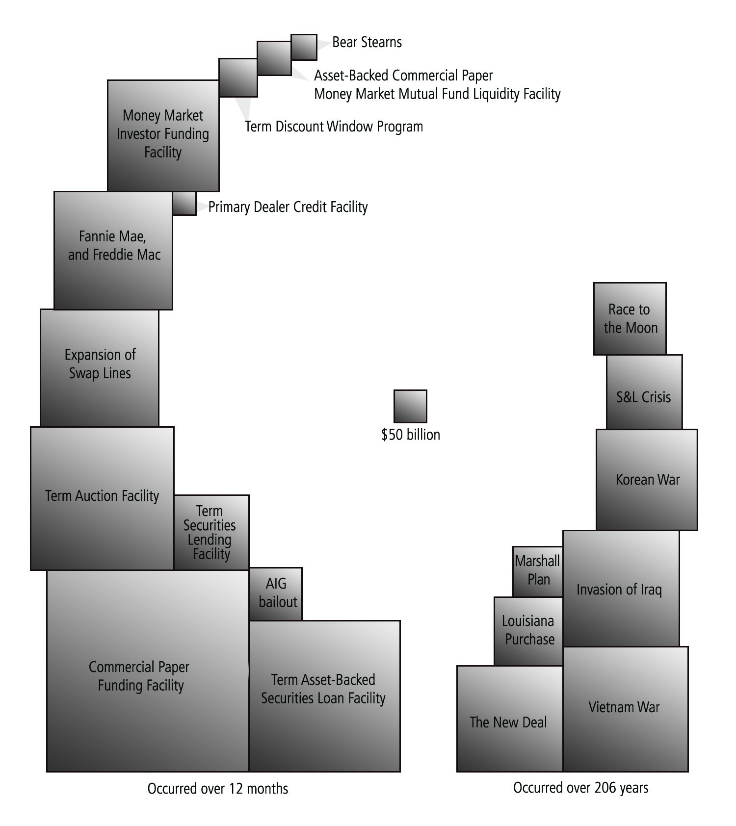
Barry Ritholtz of The Big Picture is one of my favorite economics bloggers. Actually, I quite often disagree with his conclusions but he is always thought provoking and well worth the read. This is a fabulous chart of the relative size of ginormous government spending programs. Hold your breath before you enter.
Subscribe to:
Post Comments (Atom)
No comments:
Post a Comment